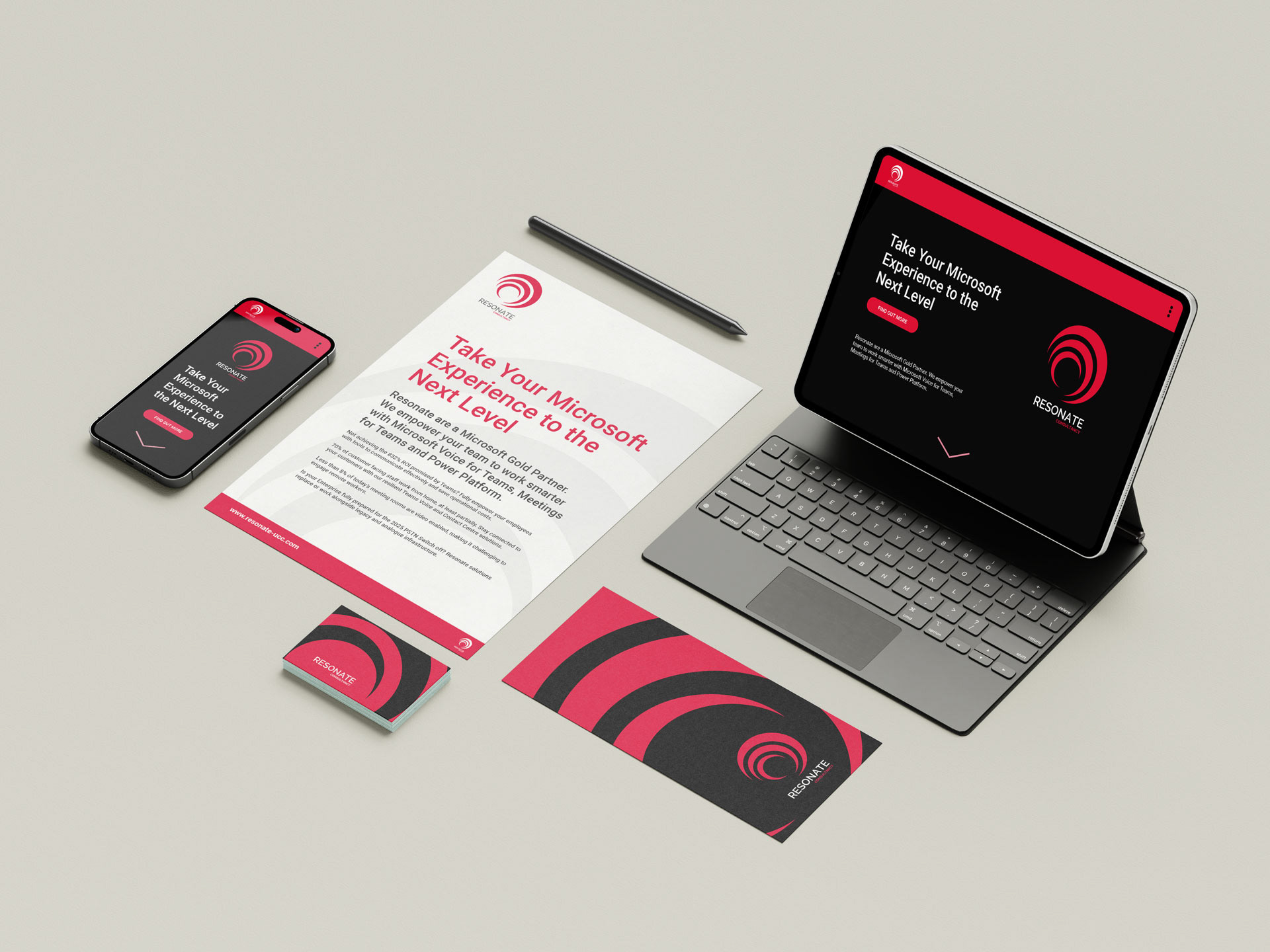
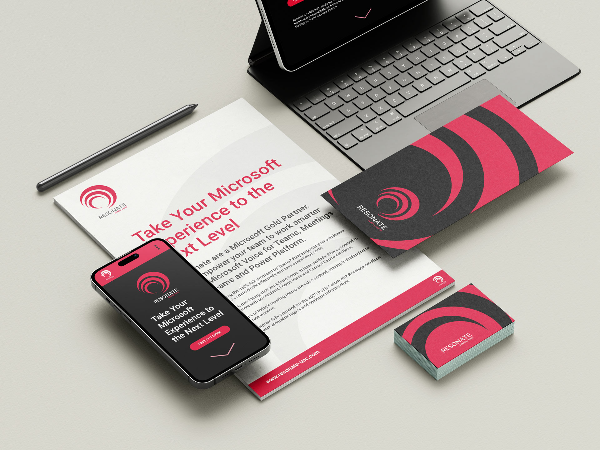
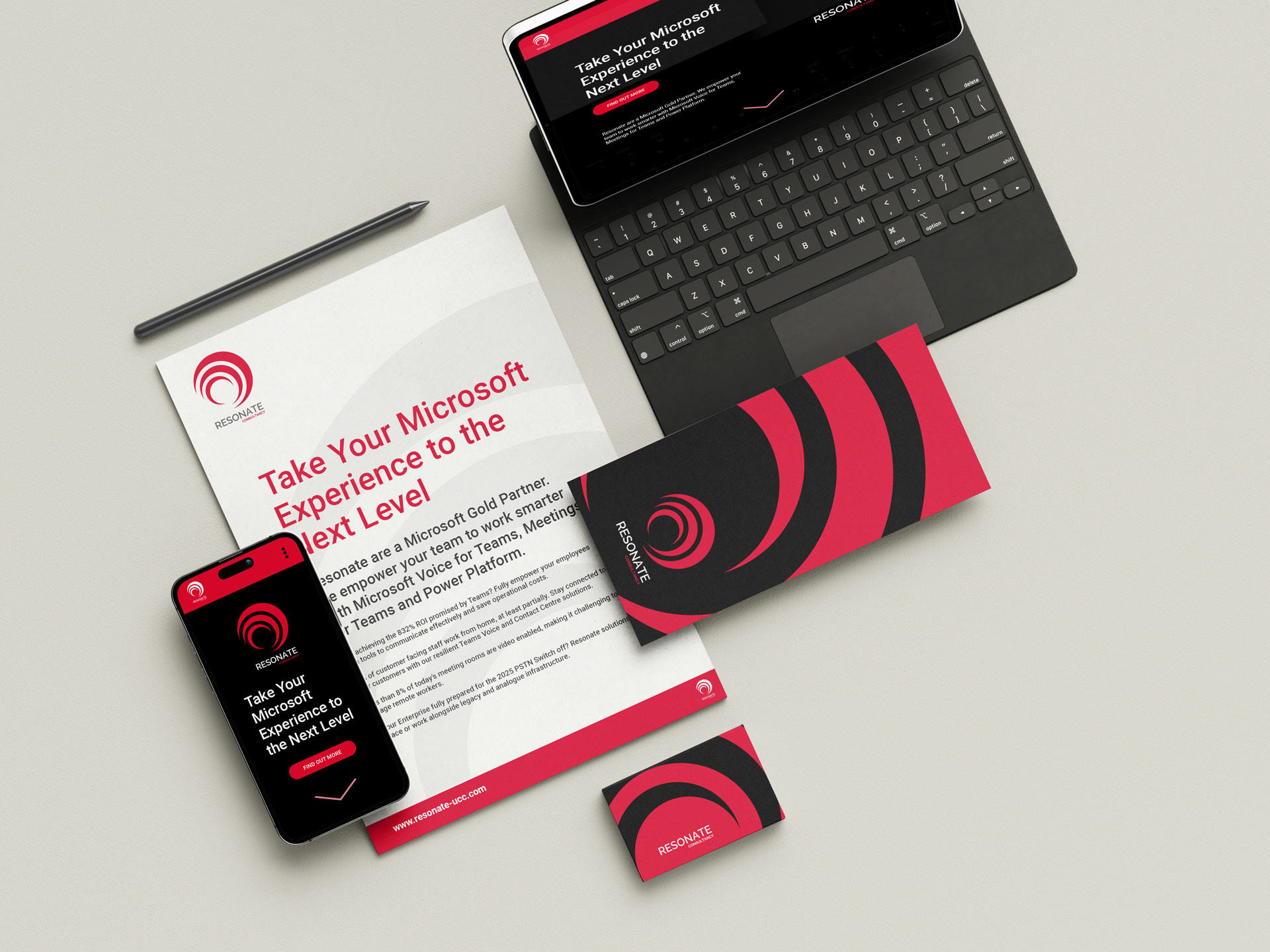
Resonate are a specialist telecommunications collaboration experts with a portfolio that includes some of the biggest corporations in the world, including; Microsoft, BP, Tesco, Home Office, Deutsche Bank and Toyota. They required a logo that wouldn't look out of place sitting alongside such powerful companies.
The design itself looks unique and in keeping with the bigger bands and more importantly, highlights the company name; Resonate. The icon design is essentially resonating outwards in a spiral shape representing the name. The colour red signifies energy, power, strength, determination and passion. All characteristics we felt that were important for a company that was, back then, a start up looking to get involved with such large corporations.