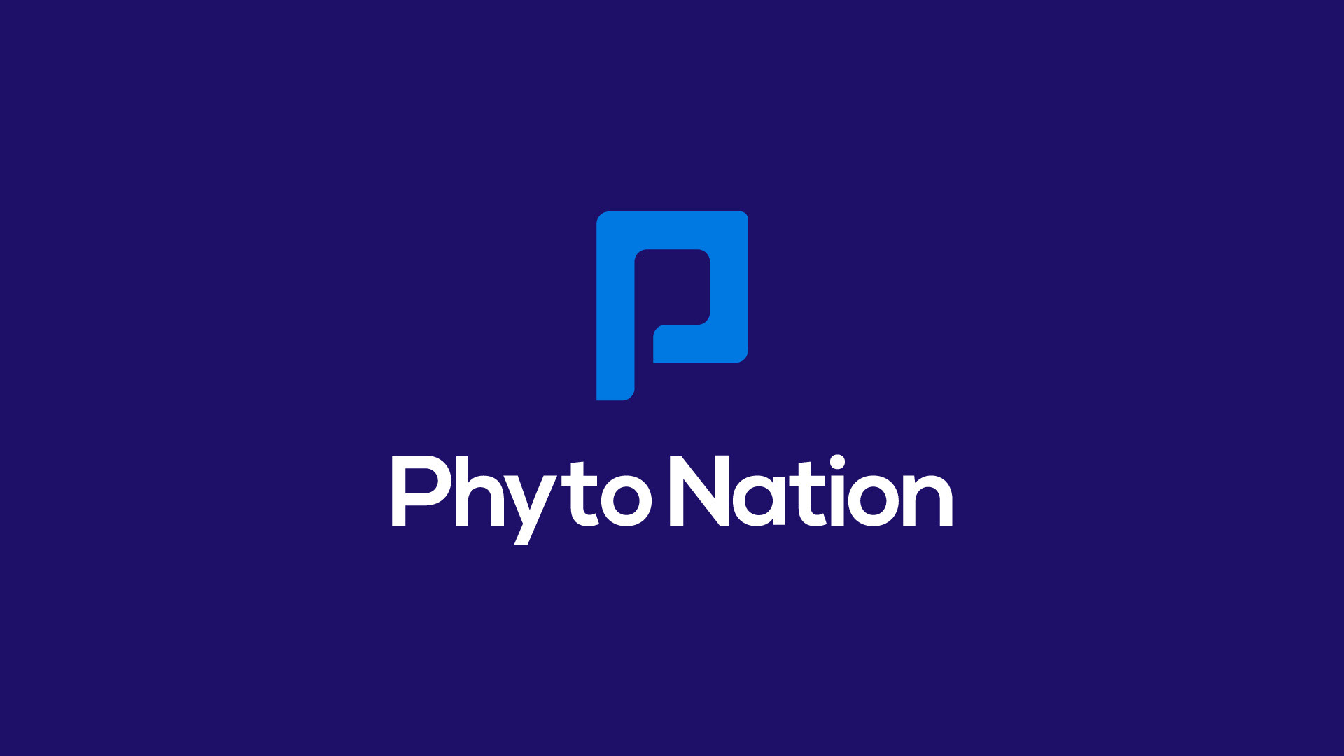
Phyto Nation is a start up cannabis enterprise specializing in medical-grade CBD and THC oils, alongside a range of other cannabis-related products.
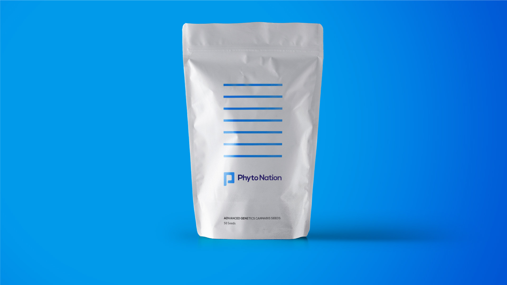
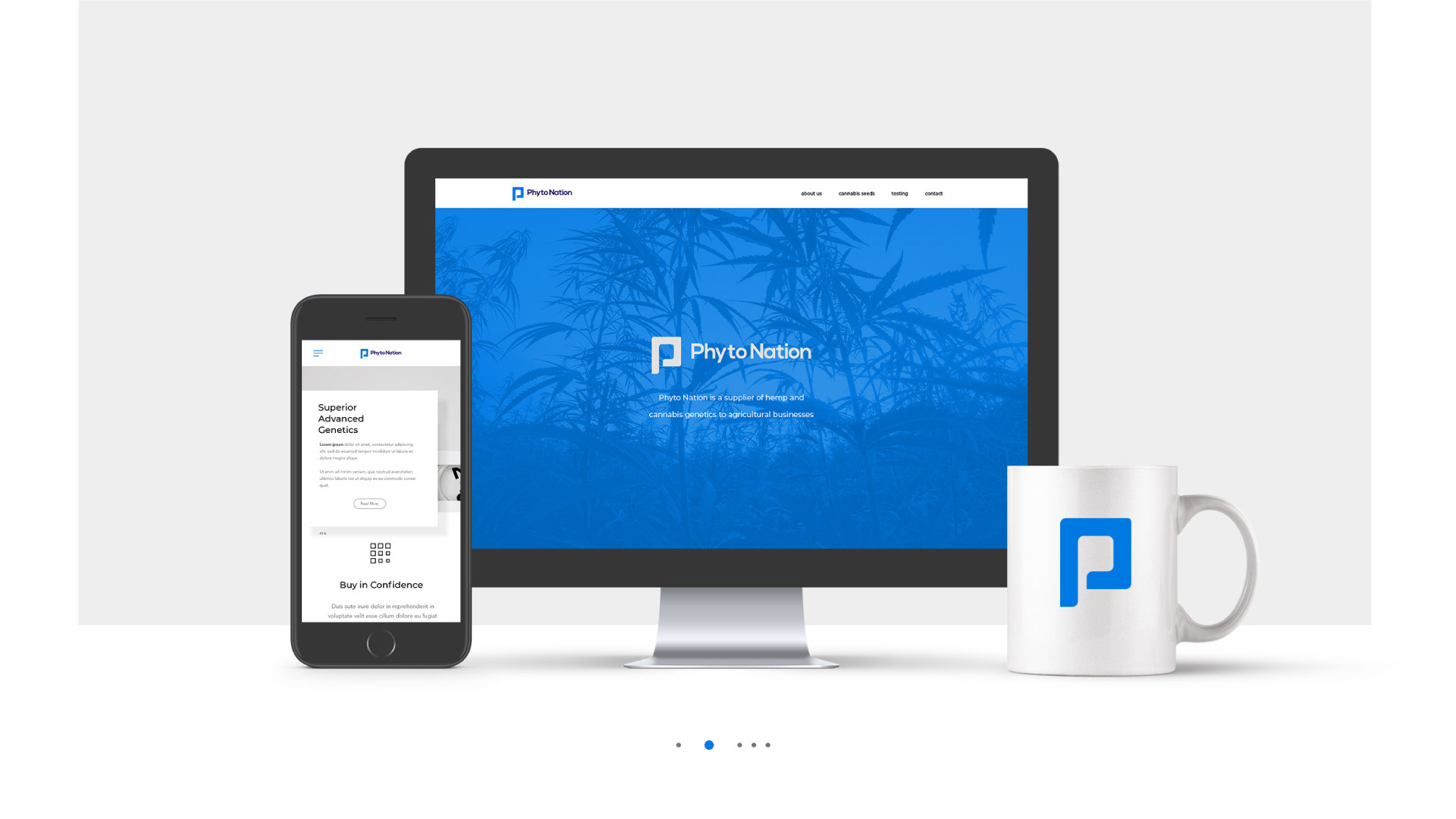
The primary objective was to infuse the brand's visual identity with a polished and professional aesthetic, inspired by the agricultural sector. This departure from the stereotypical and gimmicky imagery associated with many cannabis brands aimed to cultivate an image that resonates with pharmaceutical standards, projecting a mature and professional persona.
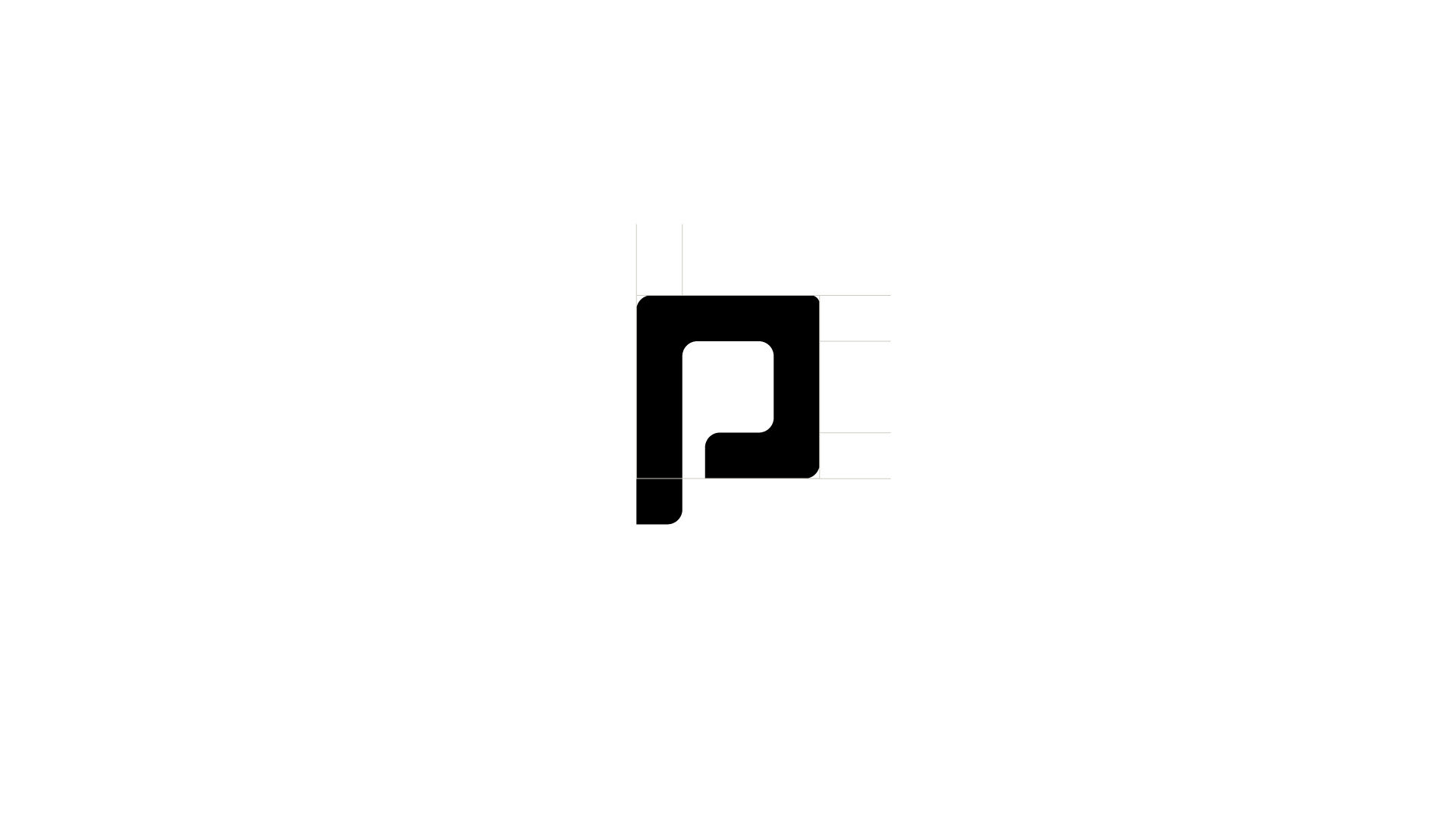
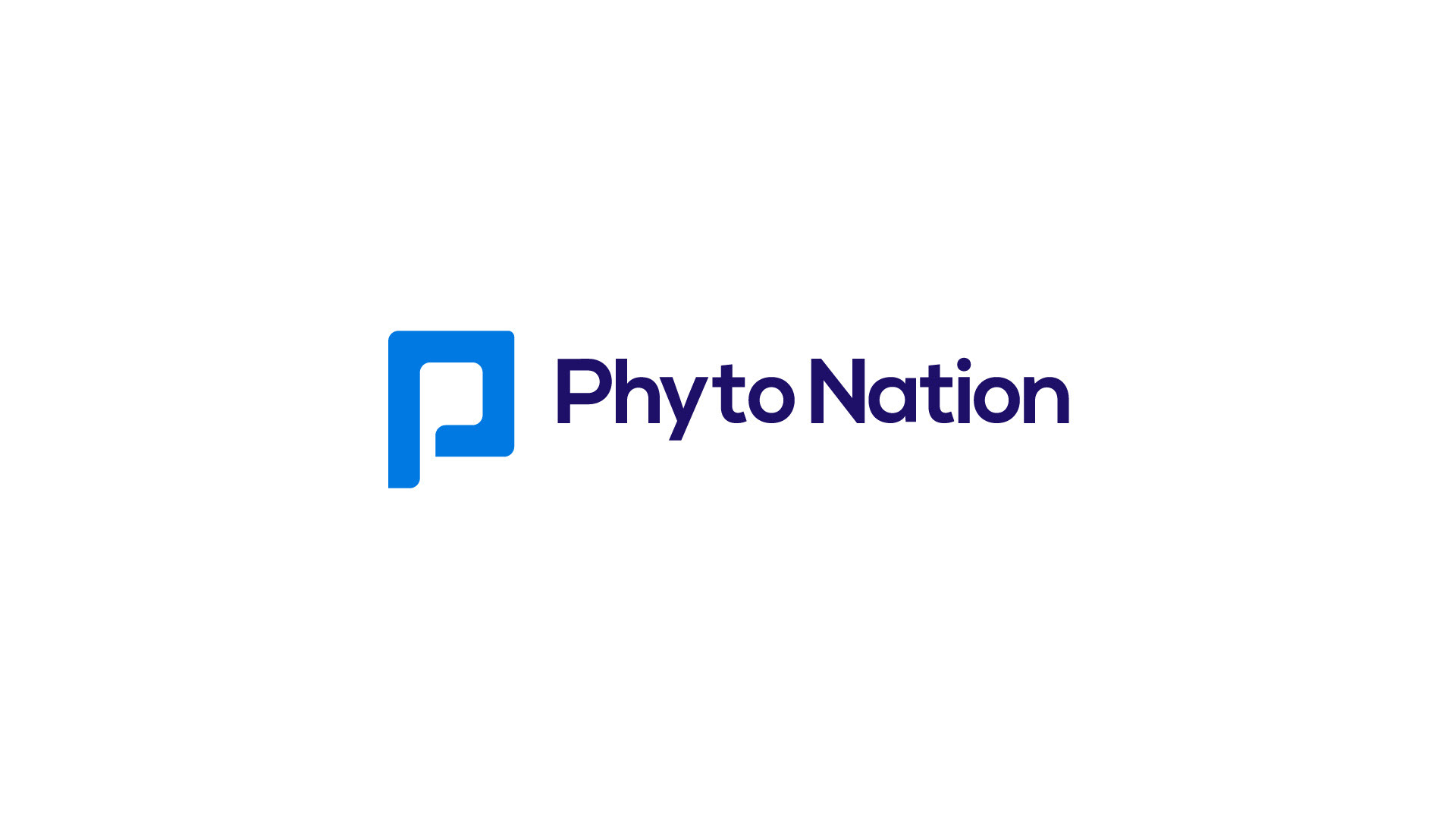
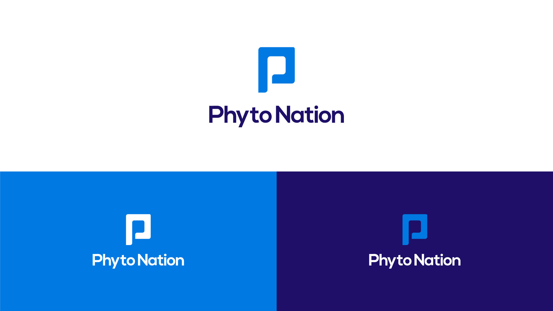
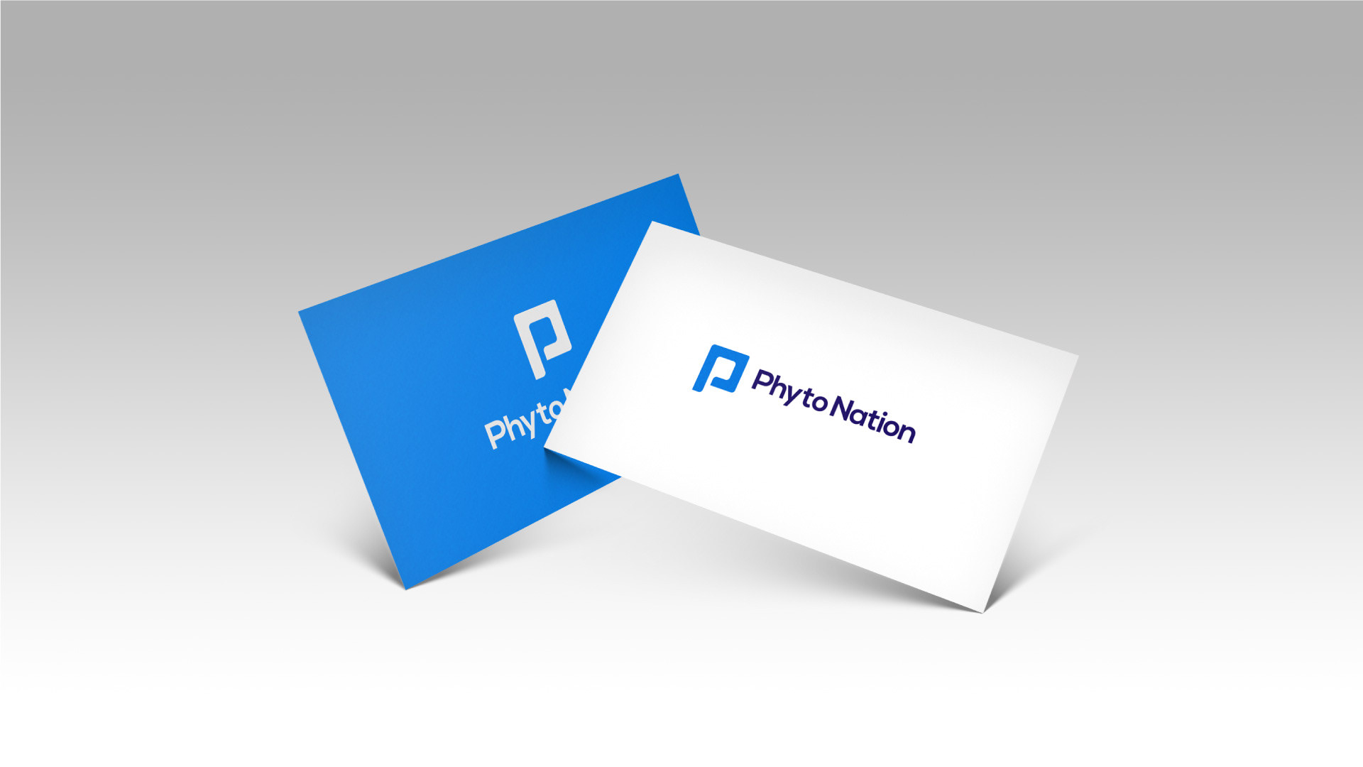
In pursuit of distinctiveness, I advocated for the adoption of a commanding typeface to function as the core identifier for the brand, whether standing alone or accompanied by an icon. Consequently, a distinctive icon was introduced, deliberately avoiding commonplace elements like dots and generic shapes. Instead, a custom-designed 'P,' derived from the business name, was crafted. This unique icon possesses the versatility to stand autonomously or be seamlessly integrated into diverse applications, whether positioned above, alongside, or independently of the brand name.